Introduction
This page tries to visualize the course of the Covid-19 spread from public sources using different kinds of graphs. The progress of the epidemy in different countries
may be observed in graphs, where values for all countries are recorded in the same graph. Some observations can be made from this. Visit
the countries comparison page to compare the epidemy spread in different countries.
A standalone page is dedicated to the data for the Czech Republic. You may find multiple graphs and values here not available for other countries.
Some interesting observations are mentioned in the results page. Some of the conclusions may be surprising. Some conclusions were made in the time
of the first wave of epidemy (March to June 2020). Further development of the epidemy brought new views on the conclusions, however they are still being relevant.
The methodology of some non-standard approaches is described in the standalone methodological notes.
Controling the application
The base of the whole application is showing a number of various graphs. They may be a bit confusing in the basic view. The graphs are however interactive
and they have some functions, which are making the view on the data much more clear:
- If the graph is showing multiple curves, it is possible to enable or disable rendering of the curve by clicking on the legend of the givne curve.
- Every graph has a menu in the right top corner allowing some graph manipulation:
-
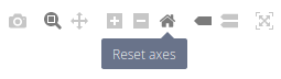
The menu contains these functions:
- Download plot as png - allows to download the graph as an image.
- Zoom - switches the graph to zoom mode. In this mode, you may zoom in or zoom out the view.
- Pan - switches the graph to move mode. In this mode you may move (pan) the view.
- Zoom in - zooms in the view in the graph.
- Zoom out - zooms out the view in the graph.
- Reset axes - resets the view in the graph to the default state.
- Show closest data on hover - shows the data value being closest to the mouse pointer.
- Compare data on hover - shows all data values for the day being closest to the mouse pointer.
- Toggle logscale - toggles the logarithmic scale of the graph (this function is available only for some of the graphs).
- Toggle fullscreen mode - toggles the fullscreen view of the graph.
On some of the pages it is possible to choose some settings. It is possible to choose countries, which will be displayed in the graphs and it is possible
to choose the time period, which will be shown in the graphs. According to the page type, the availability of settings may differ. The settings may be
changed by clicking on the link "settings" in the top part of the page. The application remembers the setting for your next visits.
Data sources
All data are generated from these sources: